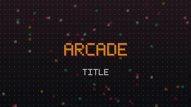
Classic arcade title screens have a look that still feels electric: bold blocky letters, generous spacing, and a sense of a machine shouting your attention across a loud room. This guide breaks down what made that lettering work and how to echo it with modern pixel text, whether you are pasting a name or building a real title.
What Defined Arcade Titles
Arcade lettering was shaped by its constraints. Screens were low resolution and viewed from a distance, so titles had to be big, bold and spaced out to read across a crowded arcade. That produced a signature style: chunky capital letters, wide gaps between them, and often a bright colour against a dark background for maximum punch.
Weight And Space
The two defining traits are weight and space. Letters were heavy so they held up at low resolution, and they were spaced apart so they did not merge into a blur from across the room. Recreate those two qualities and you are most of the way to the arcade feel.
Echoing It With Pixel Text
For a pasteable arcade look, reach for the heaviest, widest styles. Arcade Wide uses fullwidth characters with built in spacing, which mirrors the roomy cabinet feel directly. Retro Bold supplies the weight. Add the generator's letter spacing on top and you get that marquee spread without any design software.
Case And Colour
Arcade titles were almost always capitals, so switch your text to upper case. Where the destination allows colour, a single bright hue against a dark background completes the illusion. In plain text fields you cannot set colour, so lean harder on weight and spacing instead.
Building A Real Arcade Title
For an actual title screen, a poster or a thumbnail, drop the copy and paste approach and build an image with a real pixel font. There you can add the finishing touches that defined arcade art: a bright fill, a bold outline, and the layered shadow that gives letters depth. Our 3D pixel guide covers that extrusion, which is a hallmark of the era.
The Arcade Recipe
- Short phrase, all capitals.
- Heavy, wide letterforms.
- Generous spacing between characters.
- Bright colour on a dark field, where colour is possible.
- A layered shadow for depth in real artwork.
In Summary
Arcade title text is about weight, spacing and short bold phrases, all born from low resolution screens seen from afar. Echo it with wide and bold pixel styles plus extra spacing for pasteable text, or build a real image with a pixel font, bright colour and a shadow when you want the full cabinet effect. Start experimenting in the generator.