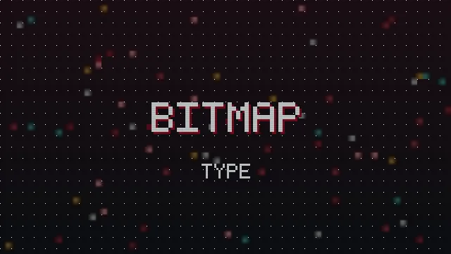
The pixel font look did not start as a style. It started as a limitation. Early screens could only show a coarse grid of dots, so letters had to be built from a handful of squares. What began as a constraint became one of the most enduring aesthetics in digital design. This guide traces that journey and explains why pixel type still feels alive today.
Born From The Grid
The first digital letters were bitmaps: each character drawn as a small grid of on or off dots. Designers had very few pixels to work with, sometimes only a five by seven grid, and every dot counted. Fitting a readable alphabet into that space was a real craft, and the results had a distinctive blocky charm that came straight from the medium.
Why Bitmaps Ruled Early Screens
Before screens could render smooth curves, bitmap fonts were the only practical option. They rendered fast, needed little memory and stayed crisp because they were designed for the exact pixel grid they appeared on. For years, nearly all on screen text was bitmap text.
From Necessity To Nostalgia
As screens gained resolution and could draw smooth, scalable type, bitmap fonts stopped being necessary. But they did not disappear. The blocky look had become tied to an era of early computing and gaming that people remembered fondly. What was once a technical compromise turned into a deliberate style, chosen for feeling rather than forced by hardware.
The Aesthetic Takes Hold
Games, art and design began reaching for pixel type on purpose. Indie developers used it to evoke classic games. Musicians and artists used it for a retro digital edge. The look spread far beyond its origins, precisely because it now stood for something.
Why It Still Feels Fresh
Pixel type endures because it does something few styles manage: it is instantly nostalgic and instantly modern at once. The grid feels honest and handmade in a world of smooth, generated design, and its associations with games and early computing keep it culturally warm. Each new generation rediscovers it, which keeps it from ever feeling truly old.
Pixel Type Today
Now the look lives everywhere: game titles, brand marks, stream overlays, social bios and copy and paste text like the styles in this tool. The generator continues that lineage, letting anyone dress a word in the grid without drawing a single pixel by hand.
In Summary
Pixel fonts grew from the hard limits of early screens, where every dot mattered, into a chosen aesthetic that outlived the constraint that created it. They survived because they came to mean something, and they stay fresh because they feel both nostalgic and modern. Every retro name you style today is a small piece of that long history. Explore the modern styles in our style tour.